COMPANY
Qubit.
ROLE
Product Design
YEAR
2018 - 2019
Qubit, founded by a small team who previously worked at Google, was pivoting from optimization to personalization when I joined them in 2018.
After introducing Silicon Valley Product Group to the rest of the business, the product team started doubling down on the user-centric approach for building the right product.
During my team at Qubit, I had the chance of working with various cross-functional teams with different business objectives.
The company had started on the path to becoming a personalization company, but all of our clients at the time were using our product, Qubit for Customer Experience (Q4CX) for CRO purposes.
I joined the team responsible for maintaining that course of enabling customers to build powerful optimization experiences, a team of five - a product manager, three product engineers, and a data scientist.
So I became the sole product designer working on the product that was generating the majority of our revenue - no pressure, right?!
DEFINING THE PROBLEM
From a design perspective, the major challenge was not knowing where to start. Qubit was the most advanced and powerful tool compared to the others in the market, but it lacked a very key element to increase its stickiness: usability.
"It requires a Ph.D. to use Qubit efficiently"
One of the many possible reasons behind this was, while it was initially built as an A/B testing product, it was transformed into this jack-of-all-trades form. There were many solutions that were built for one-off client requests or acquisition purposes and therefore, weren't scalable at all.
So, after talking to key stakeholders, we started with defining our team mission first.
Our mission:
"Build a best-in-class optimization product for developer-enabled teams."
We quickly realized what we had to do - collate the feedback the company has collected over the years. We've engaged in conversations with the Professional Services team in Qubit, went through the customer feedback in Intercom, and eventually kicked off a customer development programme (CDP) to understand our customers' current unmet needs.
Our team’s business goal was to help the company retain the majority of our customer base, which was something Qubit unable to achieve over the past two years.
We've noticed some key themes when we kicked off these conversations with our key customers, and the biggest ones were by far trust and transparency.
Trust was about making the information we show in the app trustable enough to share with their side of the business and making key decisions based on them. And transparency was us letting them know how we've come to conclusions about their data, making it so they do not treat Qubit like a black box.
INTRODUCING:
DESIGN SPRINT
To follow up on some of the plans we’ve made following our SVPG workshop, I wanted to introduce a design sprint to the team and run it to “complete the double diamond”.
Now that we've known our long-term goal and key areas to focus on, I saw this as an opportunity to diverge and introduced the idea of a design sprint to the team.
We’ve had a half-remote team (US & UK), so I had the chance of running our version of Design Sprint 2.0 as an experiment - physically and virtually in Figma at the same time!
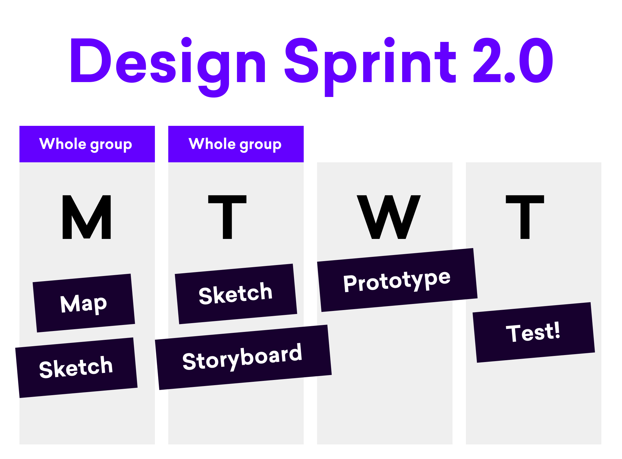
Day 1 - Mapping
I've started with problem definition, user journey mapping, and ideation on the first day. With the help of the feedback we got from research sessions we had in our CDP, we started by defining what our long term goal was for the product, what would be the sprint questions we would ask ourselves
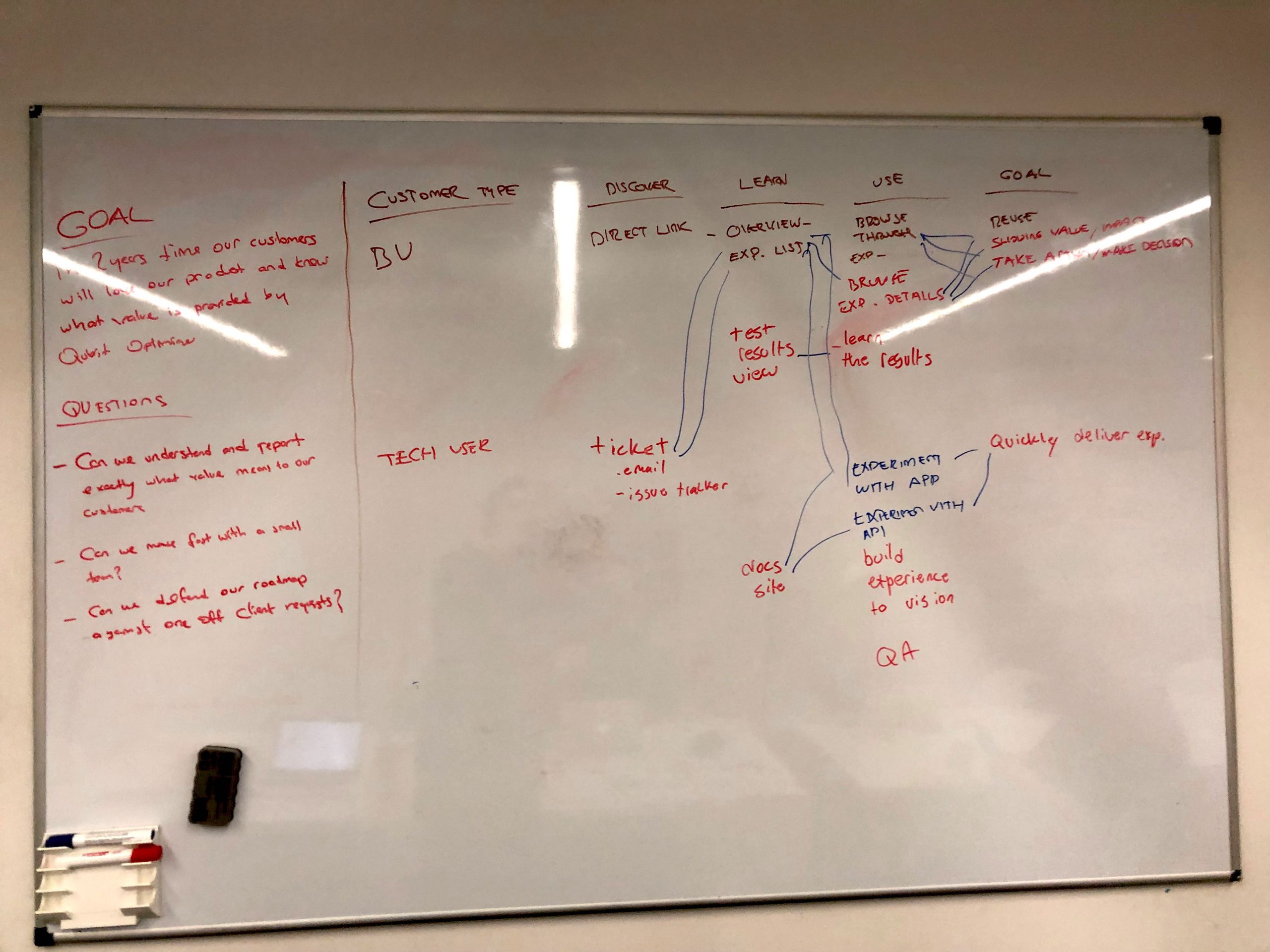
Our long term goal in the design sprint then became:
In 2 years time, our customers will love our product and what value is provided by Q4CX
and the sprint questions were as follows:
- Can we understand and report exactly what value means to our customers
- Can we move fast with a small team?
- Can we defend our road map against one-off client requests?
After doing that, we've finished the alignment by establishing the user journey and doing lightning demos and moved to the next step - ideation.
Day 1 - Sketch
We started taking notes, scribbling, and doing a round of crazy 8s. In the last hour and a half, each of us had their bright ideas in mind to sketch - only to throw them in the bin tomorrow morning!
That’s right - our goal was not coming with a perfect or final solution, but invalidating each other’s solutions to find our best bet to test - only to invalidate with clients (spoiler alert: it happened!)
Day 2 - Voting & Storyboarding
After the showcase session on the second day, we voted for solutions and agreed on one, created a storyboard from it - and turned it into a prototype on the next day.
Our assumption was alerting the user whenever their experiences were failing or not generating revenue and providing them with every data we have would definitely have a positive impact on the value they get from Qubit.
Day 3 - Prototyping
We initially believed what everyone thought when reporting something is not doing well - a notification.
In this case, it started with a daily email and a page with all the necessary information to land from that e-mail. Then the user would be able to review and take necessary actions i.e. diagnose the issue, delegate it to the right user.
And later, I built that prototype to test that idea with our clients:
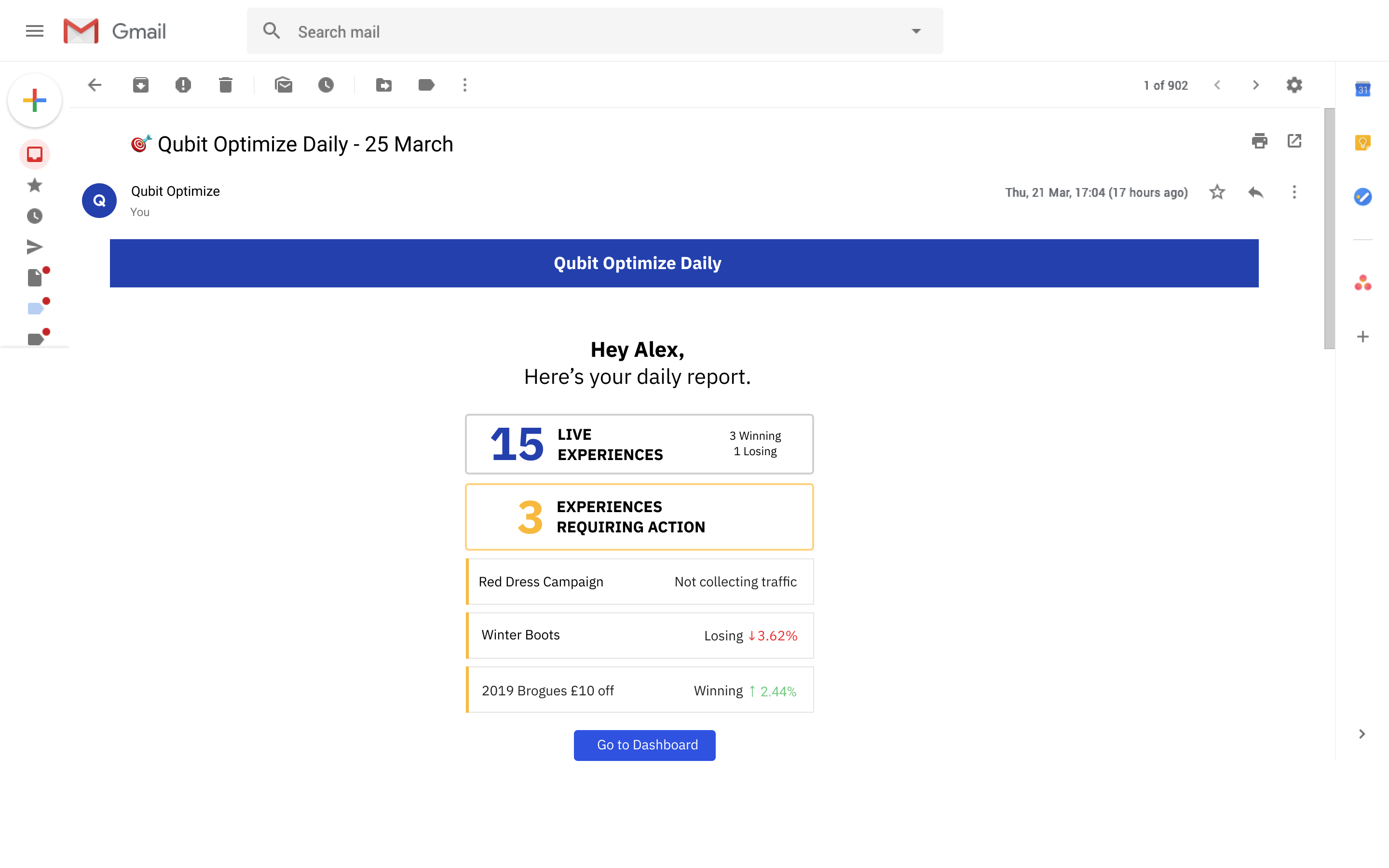
User gets a daily e-mail from Qubit on how their website experiences are performing
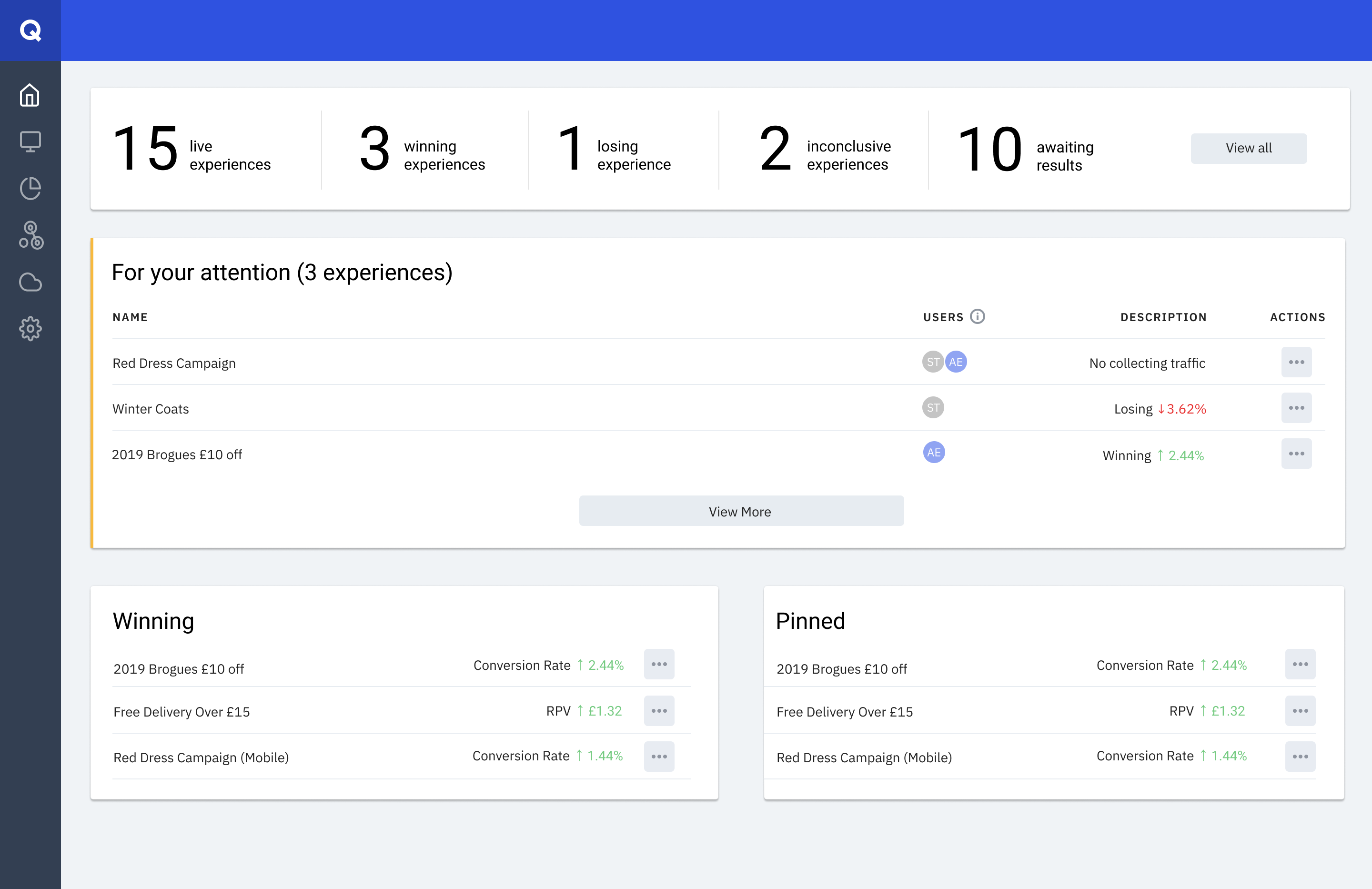
The user lands on Overview page from the email to see how their experiences are performing and if there's anything to take action on
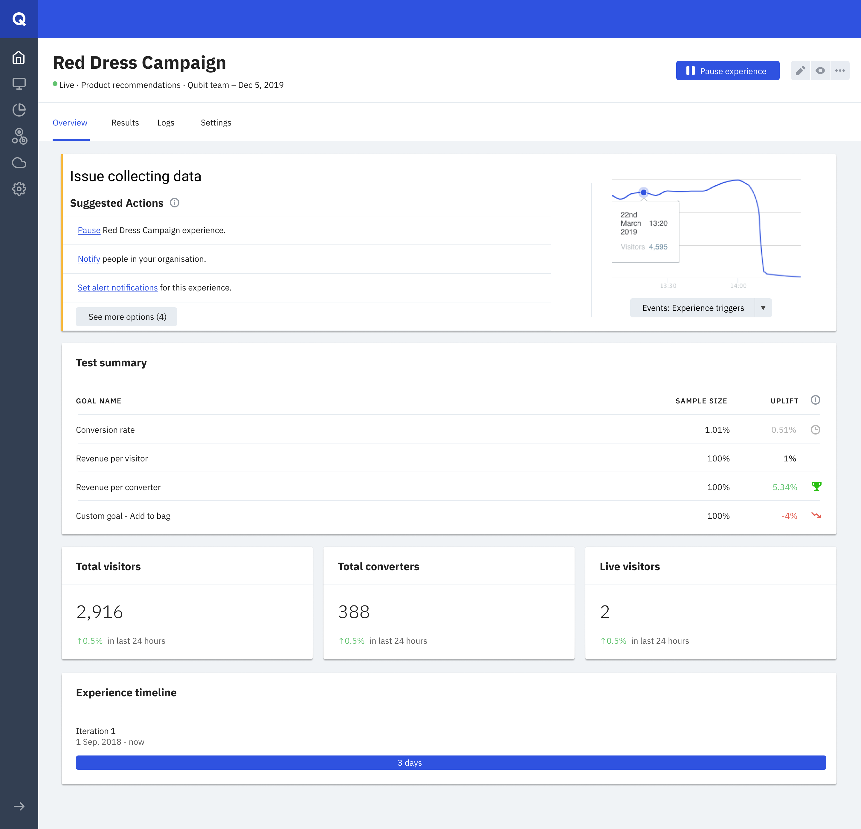
The user clicks on one of the experiences that required attention and immediately is shown what's wrong with it - and a set of suggested actions.
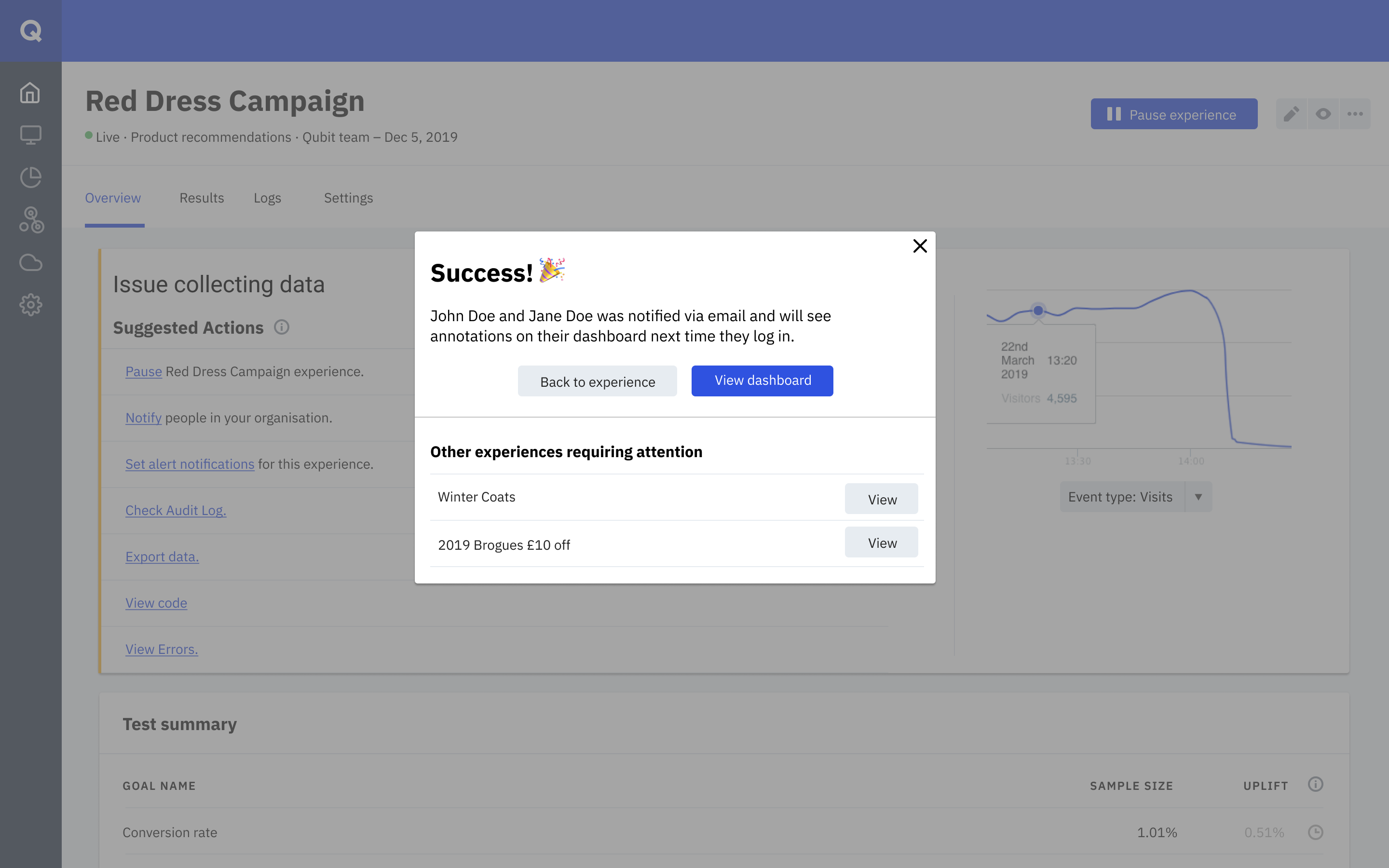
The business user is able to share it with their devs to diagnose what's wrong with the experience.
TEST:
SURPRISE SURPRISE!
So generally, this is where case studies would talk about how it was a huge success, right?
Not this one!
After running this by customers with different resources and CRO maturity, we quickly realized a few things:
- An e-mail was only going to cause more problems than it solved. Our target user, the optimization manager, is already in the platform on a daily basis, and an e-mail will either slip past by their attention or could falsely alert "the buyers" - people who were responsible for acquiring technologies like Qubit in those companies but who rarely log into the platform.
- No one wants to adopt yet another project management tool that was built inside their business app - they'd prefer to delegate in their usual ways i.e. Slack, emails, or even their own project management tools.
- People people weren’t interested in seeing “everything” to check how something’s doing. Even if they do that with all the other software in their daily work, why should we give them another one? All they wanted is to have a way to check or be alerted when something is failing to launch, get visitors, or converters.
After consolidating the feedback and synthesizing it, we regrouped to get started on working on what we thought would be good next steps - the in-app experience and reducing time to action. This would also help us scope down a part of the idea which we could build next as we were moving towards the solution.
And yes, that meant we would bin the first prototype and most of the execution there and started building a new one!
ROUND 2:
BRAVE NEW IDEAS!
We came back as a team and thought of what didn't work, and reached a consensus that we simplified the wrong parts of the journey. So we started small this time - how could we highlight the status of what's happening?
I brought up the idea of labeling states and then we quickly built a frontend prototype with health cards to easily check if an experience is running as expected - and introduced 3 states: Good, Caution, and Needs review.
Good would mean everything was working as expected while Caution was used for whenever there's something worth checking - if a goal or an event is not being tracked for example.
And finally, Needs review was used for urgent things that needed immediate action, such as an experience like a banner on the customer's website not getting any views - which would be quite alarming for high-traffic clients.
While experience health was focused on the recent activity (which made sense as the user would ideally check shortly after an issue had happened), customers would also be able to switch between the last 24 hours or all time to ensure they are seeing the right number of views, converters, etc.
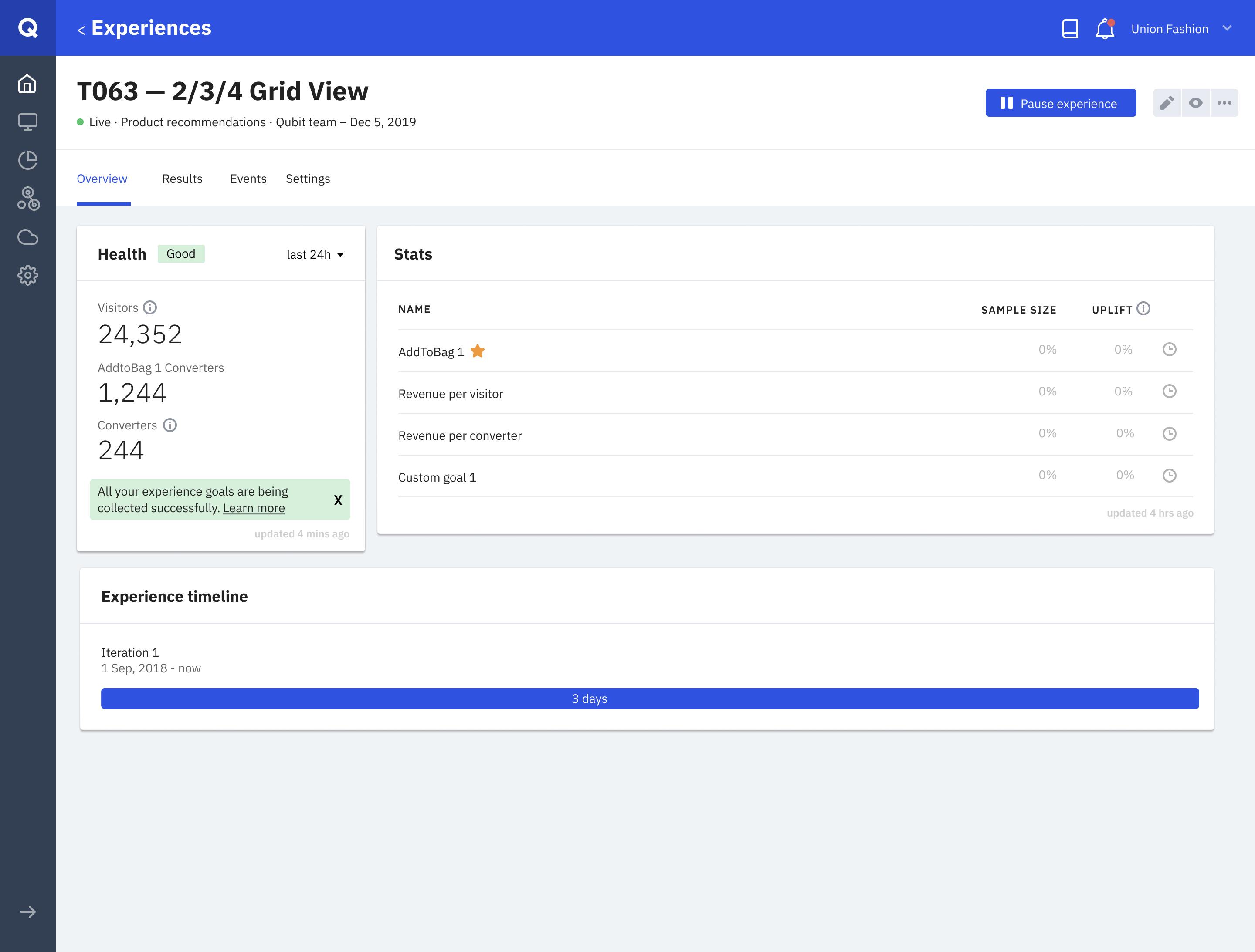
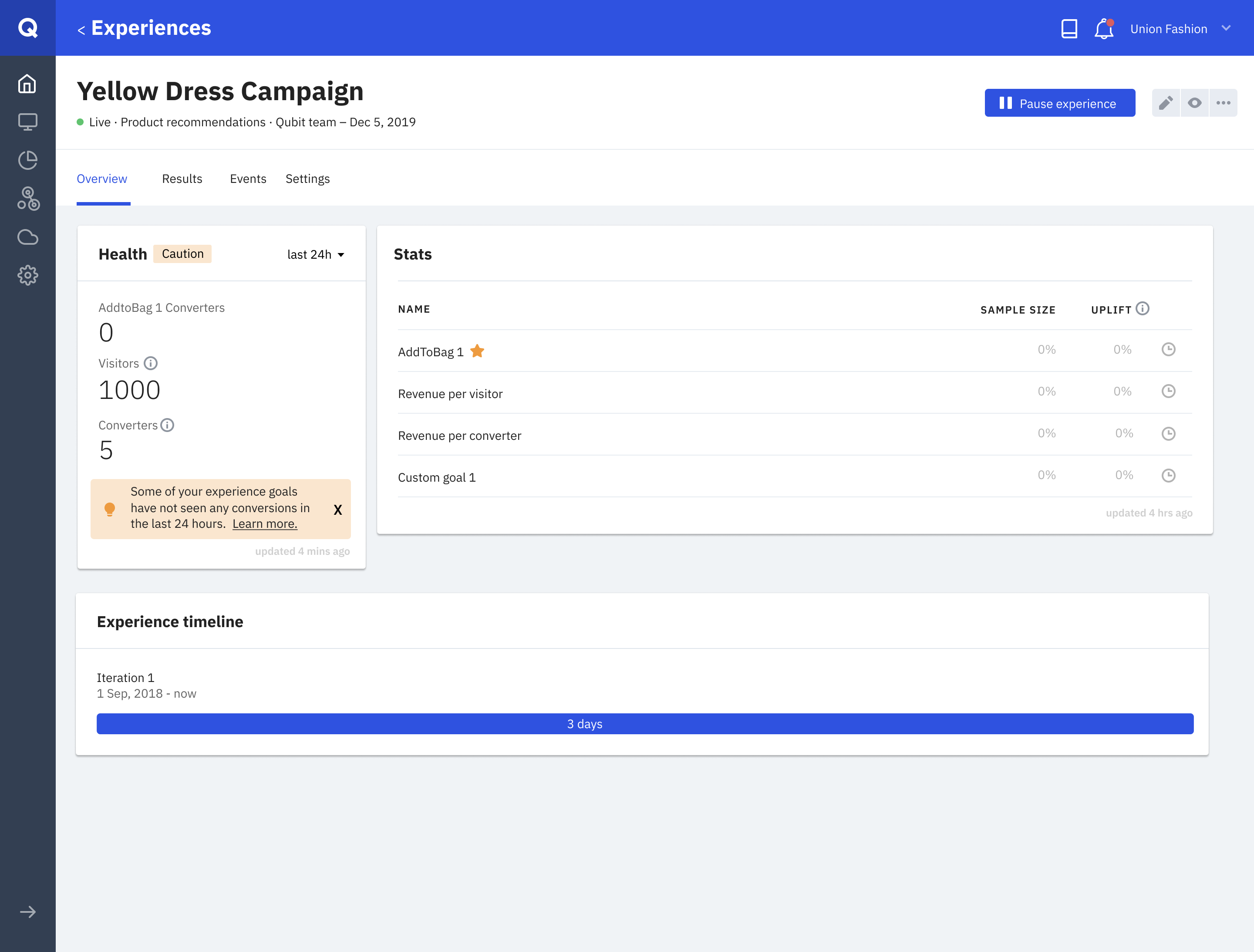
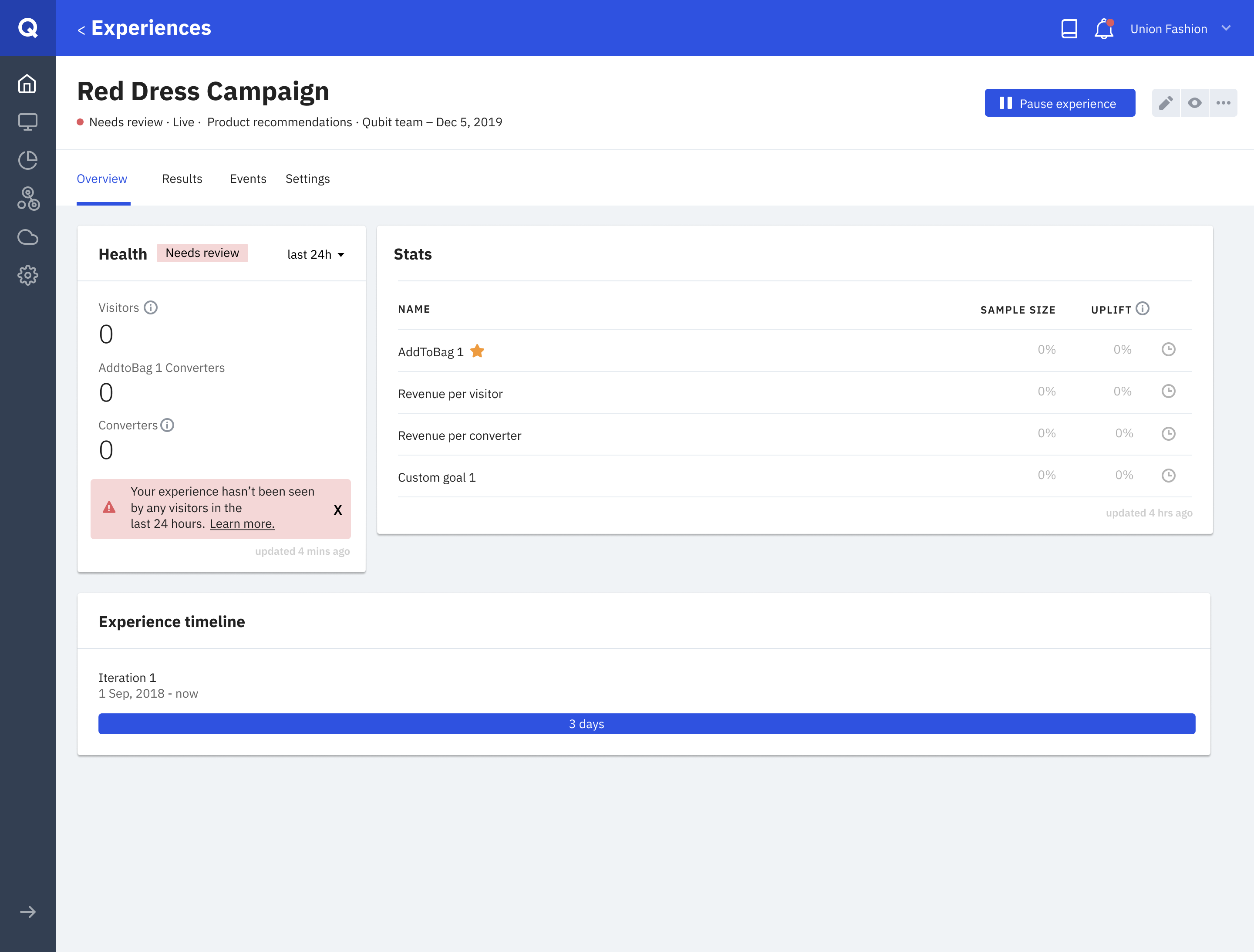
This way of labeling experiences with simpler states helped us establish trust and simplicity. Almost every client guessed it roughly accurately in the second round of feedback.
To avoid any possible confusion these states might have on others, we've also introduced separate states for paused and archived experience because showing something's not getting any traffic would simply confuse the users. And as part of that change, we've added behaviour to the card, so for those inactive experiences, timescale would switch to All-time - which was a small but vital improvement.
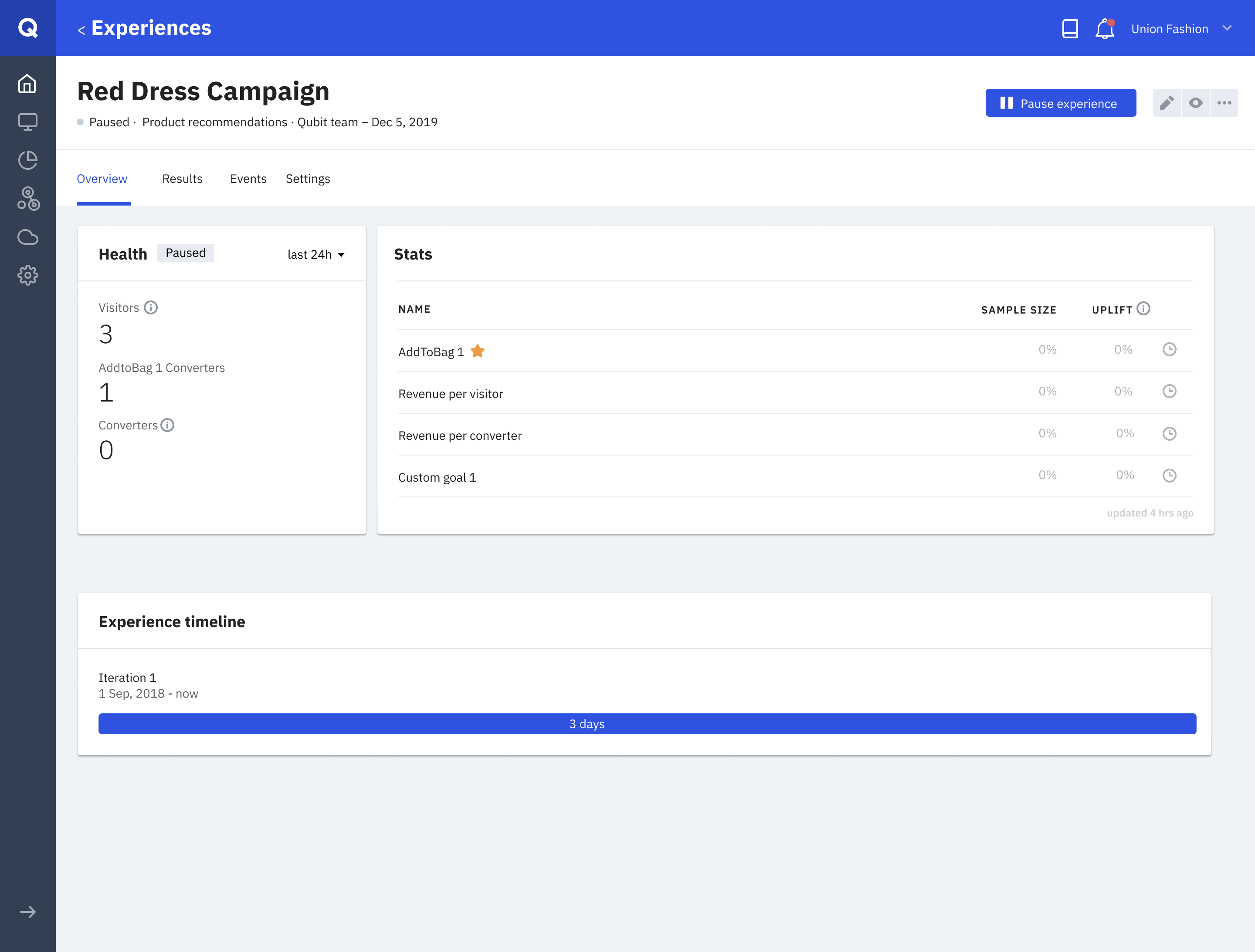
A recently paused experience without the good/caution/nr states.
I wanted to introduce another helping point for this feature - the ability to notify users if an experience’s health state worsens. This would also greatly reduce the time to act.
We built the in-app notification, and more importantly, didn’t forget to remind ourselves how annoying notifications can be in this day & age. Any notification trigger we’d let the system push had to be very important™.
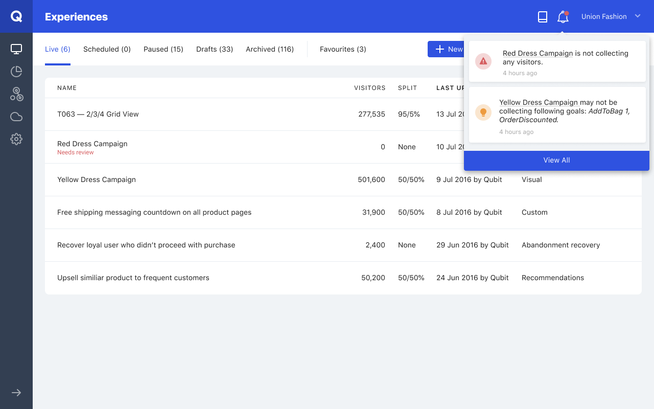
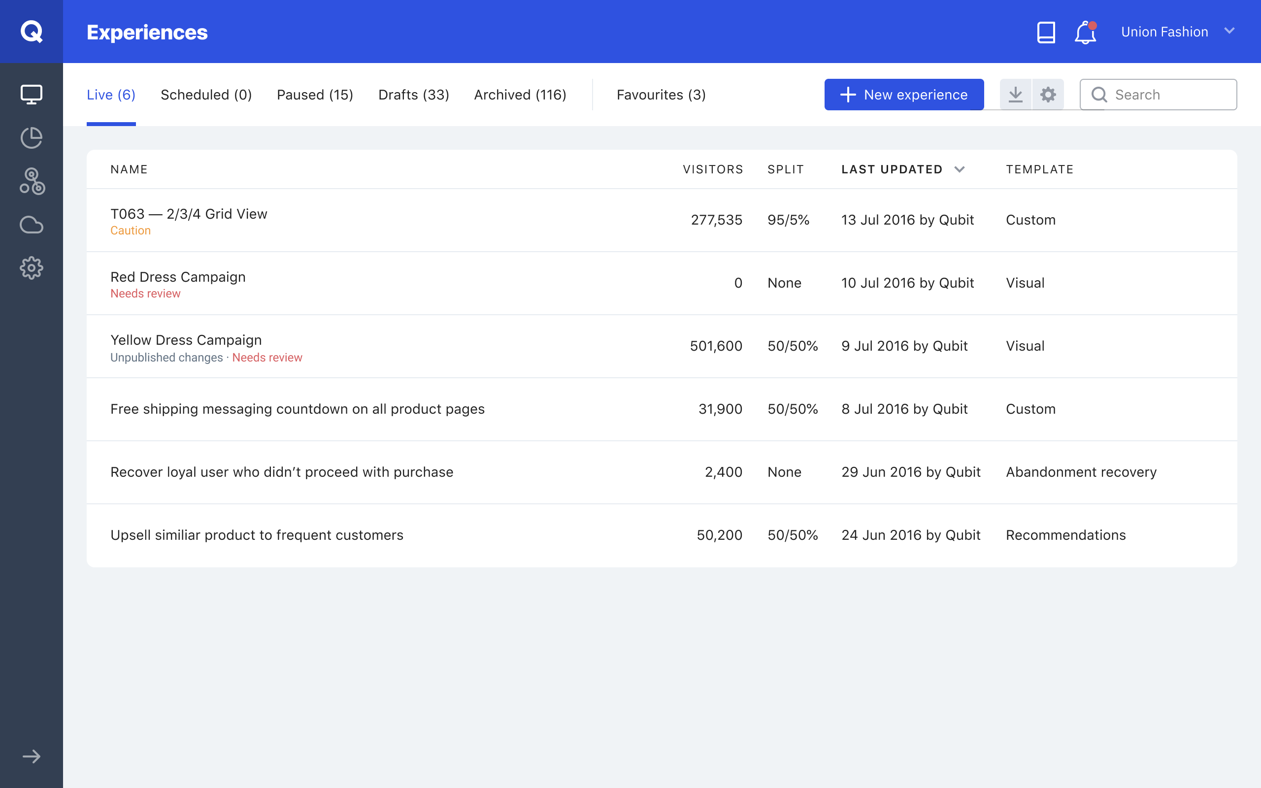
Users would easily be able to see if experience had a Caution or Needs review state. After introducing health states to this list, we've then used this space to show different messages too - experiences that needed republishing or with experiences with ITP 2.1 issues
WHAT NEXT?
Shortly after releasing these features into closed beta and getting great validation and feedback from clients, we've added a third layer, a quick way to check how if any experience needs to be checked on the experience list page.
Further down the road, we've started working on turning this health card into a health hub, a place for clients to check everything regarding the experience's health i.e. how many clients are viewing the experience with errors or if the experience has too many goals
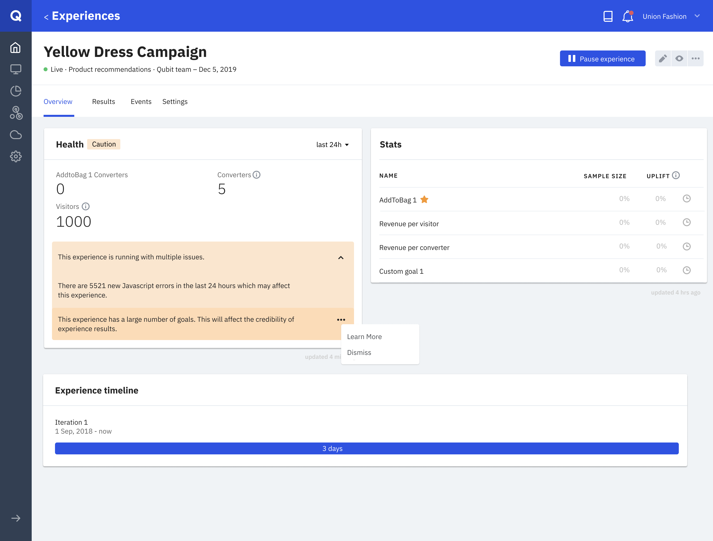
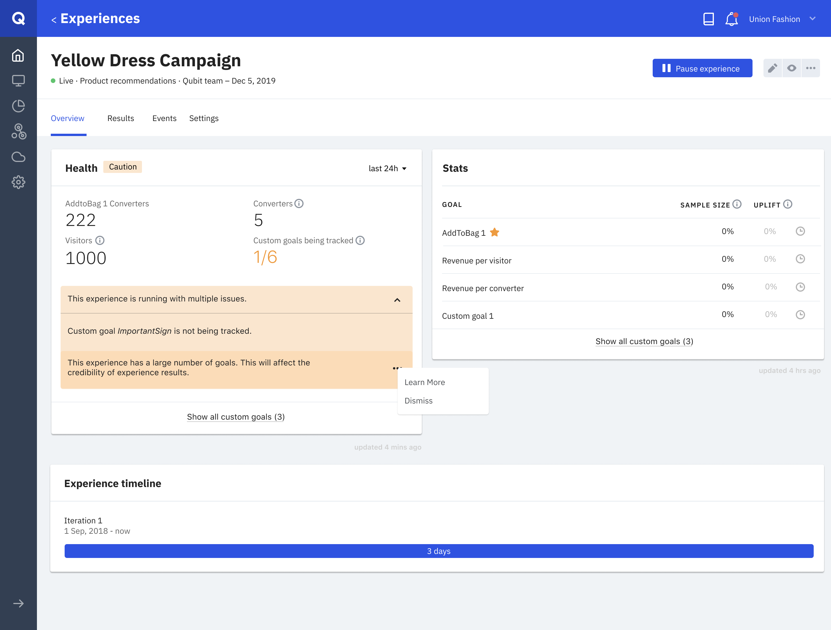
Two experiences with caution states due to different reasons. Each message would have it's different set of actions in the context menu, such as viewing code, opening docs site to learn more, etc.
A few examples of what cases triggered which health states.
OUTCOMES
Building this feature has helped the team and the rest of the business understand the importance of the design processes. In the past, Qubit has usually over-engineered without any sort of user research. And seeing how the first bet didn't resonate with clients made an emphasis on the need for user-centric design.
Right after releasing this feature to beta clients (and then to everyone else), we tracked how it decreased the number of tickets that were created because of health monitoring.
We also heard great feedback from clients on the client development program that we kicked-off during this project, especially about how valuable they find the sessions we ran with them. It also helped us slowing and eventually stopping the decline of customer retention. And that was quite important as it meant we were tackling the right things we had picked at the beginning - trust & transparency.
But most importantly, this process set a great example for the ways of working when it came to making product & design decisions for other teams in Qubit. While we kept similar processes within our team, we also shared what we had learned with other product teams that were tackling different problems.
LEARNINGS
What worked well?
- Design sprint as an exercise. We applied different versions of it on different problems and essentially became more efficient at doing this and other design workshops.
- Being open-minded and willing to iterate. We could've looked for any sort of confirmation at the end of the first round, but being open to feedback steered us in the right direction.
- Focusing on clarity and simplicity to empower users and build transparency. While Qubit is a powerful tool - giving every tool to the user is not necessarily the solution.
What could be improved?
- Also, Design Sprint. After a retro with the team, it was obvious that while Design Sprint was a success, it felt very proccess-y and we could've talked more. I saw this as a sign to adapt our version of it and iterate on design sprints themselves over the years.
- Talking to clients after the release. While we monitored the number of tickets and got feedback from our customer teams, we never went back to hear how clients have been using the feature. Whilst it had a good impact on the value Qubit drives, we knew that might not always be the case.